There have been two London 2012 logos:
one for the bidding process created by Kino Design and a second as the brand
for the Games themselves. The former is a ribbon with blue, yellow, black,
green, and red stripes winding through the text "LONDON 2012," making
the shape of the River Thames in East London. The latter, designed by Wolff Olins, was unveiled on
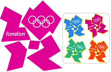
4 June 2007 .This new logo is a representation of the number 2012, with the Olympic Rings embedded within the zero.
The Paralympics logo (far left) and the different official colour combinations for the Wolff Olins main logo design
This will be the first time that the
same essential logo is to be used for both the Olympic and Paralympic games.
The standard colours are green,
magenta, orange and blue; however, the logo has incorporated a variety of
colours, including the Union Flag to promote the handover ceremony. The flexibility of the logo has
enabled sponsors to incorporate their corporate colours into a personalised
version.
No comments:
Post a Comment